Cover Me

I spent my evening at the monthly meeting of my local science fiction (and fantasy) fan/reading group tonight. We’re about to wrap up our 26th? year. We’ve been at it a long time. One of the things we’ve been doing during that time is creating a monthly fanzine.

There was a time when I was very bitter that we were clearly eligible for winning a Hugo award in the fanzine category and could never gain any traction, even with our own members. That eventually slid into disappointment more than bitterness, and then into happiness that we weren’t tied to scandals and terrible nonsense.

These days, we keep creating the fanzine because it’s a small thing that brings us joy. A few dozen ‘subscribers’ and a way to get some relatable content out to our friends. Yes, we’re still eligible to win a Hugo but I’m no longer certain it’s a thing we would want.

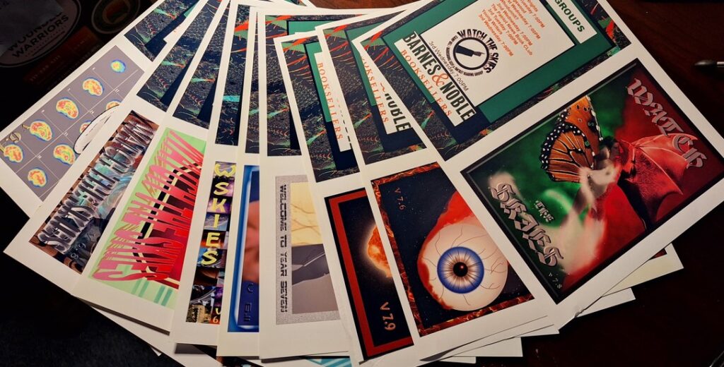
Jeff dug up some physical copies of old covers. For many years we had an actual, printed paper copy to hand out live and in person to anyone showing up for the meeting. These old pages showed me a variety of the kind of artwork I’ve done over the years. A lot of what I saw here was cringeworthy. Some of them I like to this day.

I don’t post as much about my art here these days in part because there’s less of it than there used to be. I just don’t have the same amount of time I did before. There are so many things to do in this world that sometimes I lose track and don’t create as much art as I’d like. Even the cringey stuff. Gotta break some eggs and all that.

I suggest doing art. Create something. Save it if you like OR give it to somebody. Someday it might come back to you so you can see how far you have come.

Kaiju Trees

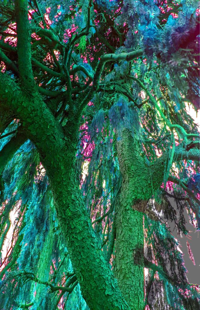
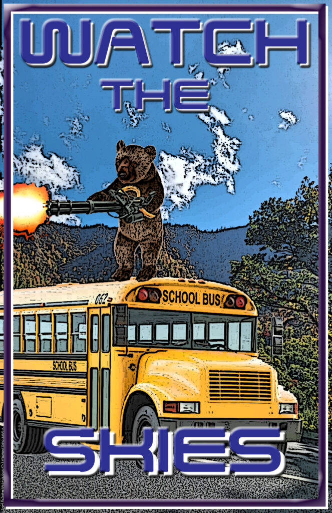
Sometimes the fun part of coming up with cover art for the fanzine each month is trying to figure out what an alien landscape will look like. Sometimes that’s the most daunting part as well. What if it’s not described well? What if your vision is absolutely NOT what the author had in mind?

This month Watch The Skies is reading Kaiju Preservation Society by Scalzi.

Spoiler alert – there are different trees in this novel… and I had fun making them. Here’s a background preview of this month’s cover:

Still Watching

We’re closing in on the end of the 23rd year of the fan group Watch The Skies. It’s been an amazing run and I genuinely hope it rolls at least another 23 years or more.

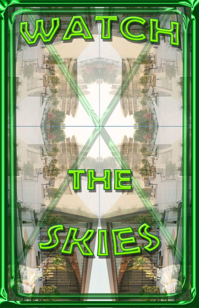
We still publish a fanzine each month and I still get the opportunity to make cover art for the various issues. The August book we were discussing was called Paradox Hotel. I liked the visual concept of various versions of the hotel being slightly out of focus with each other. A blurry filter over the camera lens. I pulled together some images and set to work. Here’s the cover for the August issue:

Over Hill, Over Dale

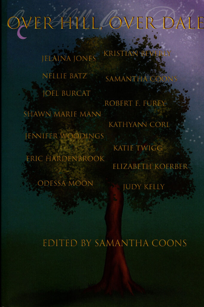
The new book Over Hill, Over Dale is out! Why am I so excited? Because it contains my story Evilution (lucky story #13 in the book). This is a short story collection from the Story Makers class at Cupboard Maker Books.

Check out the cover!

As far as I know – this is an *in person* book – meaning you’ve got to visit the store to get it. (You should totally visit the store). We did a book signing for any of the authors that could make it on the July 4th holiday. The signing seemed to be very successful given how summer schedules normally work out.

It was nice to be back and doing the “author thing” in person. I’m still writing stories, firing them off into the aether and waiting for the inevitable negative bounce back. I think my next author in person event might be a convention… but those plans are still far enough off as to be shadowy and lurking just out of view.

I’d love to hear what you thought of my story in this collection. Grab a copy and let me know!

Cover Art

As this week winds down we’re closing in on the end of the nomination period for the Hugo awards. For the past 20 years Watch The Skies has been publishing a fanzine that is eligible for the award. For each of those fanzines, cover art is needed. I’ve done a bunch of them.

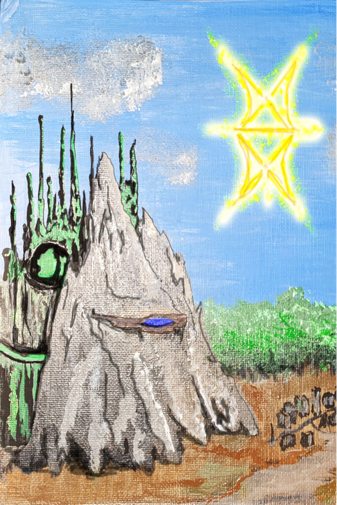
Lately I’ve started to move back toward creating art that is NOT strictly digital. The cover art for this month’s edition actually started as an acrylic painting. Yes, I needed to get a picture of it and add some digital things like a border and title, but the base is still a painting.

When I say in my bio that I’m a fan, author and artist… it’s not always in that order. I know I’ll never win any awards, but it’s still important to create. Here’s the painting with out the border or text (high res photos do my no favors – this actually looks better in person).

Draw! Paint! Create!